Lighthouse LabsW8D4 - Unsupervised LearningInstructor: Socorro E. Dominguez-Vidana |

|
![]()
Overview:
- [] Different types of learnings in machine learning.
- [] Unsupervised learning use cases
- [] Different types of clustering
- [] Evaluation of clusters
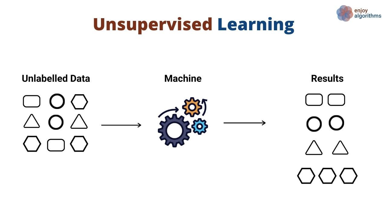
Unsupervised Learning:
- Learning from data without explicit labels, where the algorithm finds hidden patterns or intrinsic structures.
- Market segmentation, anomaly detection, and exploratory data analysis.
Author unknown. (n.d.). Data Science vs. Machine Learning Medium.
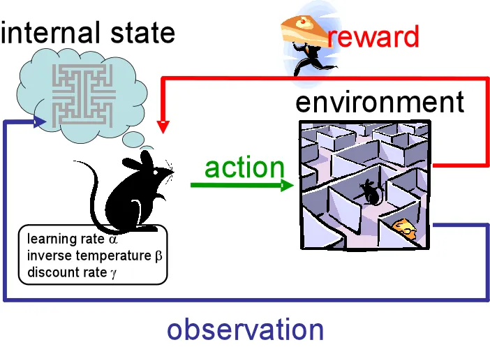
Reinforcement Learning:
- Learning by interacting with an environment to maximize cumulative reward.
- Game AI, robotics, optimization problems.
Rana, P. (2020, March 25). Reinforcement learning overview. Medium.
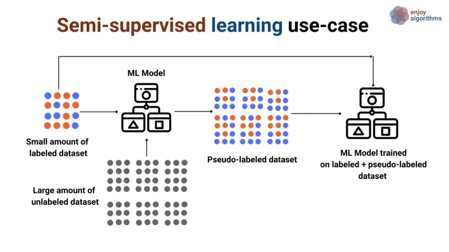
Semi-supervised Learning:
- Learning from a small amount of labeled data combined with a large amount of unlabeled data.
- Text classification, image recognition.
 Sharma, G. (2020, June 20). A gentle introduction to semi-supervised learning. Medium.
Unsupervised Learning Use Cases
Customer Segmentation:
- Clustering algorithms group customers based on purchasing behavior, helping businesses identify different market segments.
Anomaly Detection:
- Identify unusual data points, often used for fraud detection, network security, and medical diagnosis.
Recommendation Systems:
- Algorithms like K-means clustering can recommend products by grouping similar users or products based on features.
Dimensionality Reduction (PCA):
- Used for reducing the complexity of data, particularly when dealing with high-dimensional datasets, while preserving variance for tasks like visualization or preprocessing.
Clustering
- Clustering is the task of dividing a dataset into groups (or clusters) such that the data points in the same group are more similar to each other than to those in other groups.
Clustering Algorithms:
- Partitioning Methods:
K-Means: Divides the data into K clusters based on minimizing variance within clusters.
- Hierarchical Methods:
Agglomerative Hierarchical Clustering: A bottom-up approach where each observation starts in its own cluster, and clusters are merged iteratively.Divisive Hierarchical Clustering: A top-down approach where all data points start in one cluster and are split iteratively.
- Density-Based Methods:
DBSCAN(Density-Based Spatial Clustering of Applications with Noise): Clusters based on density, identifying areas of high data point concentration. Works well with irregularly shaped clusters and is robust to outliers.
“Gremlin Risk Management Task Force” in Kingston Falls
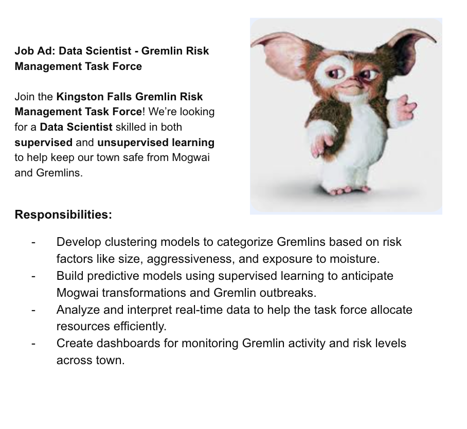
Imagine that you are a new Data Scientist at Kingston Falls's Gremlin Risk Management Task Force and you have to develop a system that categorizes Gremlins based on their behaviors, physical traits, and environmental exposure.
The goal is to manage the risks posed by different types of Gremlins, ranging from harmless Mogwai to the most dangerous and aggressive Gremlins. The town lacks labeled data about what makes a Gremlin dangerous or manageable.
The office gives you the Gremlins dataset with the following columns:
| Feature | Description |
|---|---|
| Size (cm) | The height of the Gremlin or Mogwai in centimeters. |
| Weight (kg) | The weight of the Gremlin or Mogwai in kilograms. |
| Color_Intensity | A scale (0-100) representing the intensity of the creature's color (darker = more intense). |
| Aggressiveness | A scale (1-10) measuring how aggressive the Gremlin is (1 = docile, 10 = highly aggressive). |
| Intelligence | A scale (1-10) measuring the creature's intelligence. |
| Number of Spikes | The number of spikes or physical protrusions on the Gremlin (0 for Mogwai). |
| Age (years) | The age of the Gremlin or Mogwai in years. |
| Moisture Exposure (hrs) | The number of hours the creature has been exposed to moisture (triggers Gremlin transformation). |
| Fed_After_Midnight | Binary feature (0 = not fed after midnight, 1 = fed after midnight, which transforms Mogwai to Gremlins). |
import numpy as np
import pandas as pd
from sklearn.decomposition import PCA
import matplotlib.pyplot as plt
import matplotlib.image as mpimg
import seaborn as sns
gremlins_df = pd.read_csv('data/gremlins.csv')
gremlins_df.head()
| Size (cm) | Weight (kg) | Color_Intensity | Aggressiveness | Intelligence | Number of Spikes | Age (years) | Moisture Exposure (hrs) | Fed_After_Midnight | |
|---|---|---|---|---|---|---|---|---|---|
| 0 | 26.236204 | 14.082659 | 43.100903 | 6 | 8 | 2 | 2.204537 | 1.813789 | 1 |
| 1 | 43.521429 | 7.395619 | 71.881278 | 7 | 7 | 12 | 7.197828 | 4.305340 | 0 |
| 2 | 36.959818 | 6.448949 | 72.438107 | 10 | 10 | 11 | 5.041019 | 1.097553 | 0 |
| 3 | 32.959755 | 9.894528 | 78.245794 | 10 | 3 | 4 | 7.595426 | 4.872736 | 1 |
| 4 | 19.680559 | 14.856505 | 83.565480 | 3 | 1 | 5 | 1.208577 | 3.898794 | 0 |
Hierarchical Clustering
- Builds a hierarchy of clusters, either agglomeratively (bottom-up) or divisively (top-down). We will focus on agglomerative clustering here.
from scipy.cluster.hierarchy import dendrogram, linkage
linked = linkage(gremlins_df, method='ward')
plt.figure(figsize=(10, 7))
dendrogram(linked, orientation='top', distance_sort='descending', show_leaf_counts=True)
plt.title('Hierarchical Clustering Dendrogram')
plt.show()

Interpretation: The y-axis in the dendrogram represents the dissimilarity or distance between clusters, with higher points indicating the merging of more dissimilar clusters.
A large gap at the top (
~250 mark) suggests a strong division between the two main branches (orange and green), indicating two distinct groups.Leaves at the bottom represent individual Gremlins, and as you move up, they merge into larger clusters based on similarity.
To choose the number of clusters, you can "cut" the dendrogram at a particular height. For example, cutting at around 100 on the
y-axisyields three main clusters (one large orange group, one smaller green group, and an intermediate group - probablyMogwai-like,Mischievous, andHighly AggressiveGremlins).A lower cut (around 50) would result in smaller, more detailed clusters.
KMeans Clustering
- Algorithm based on Expectation Maximization
Kis a hyperparameter that stands for the number of clusters.- Random initial centroids
- Data points assigned to clusters based on Euclidean (or other type of) distance.
- Cluster centroids updated based on data points
- Steps repeat until convergence
Characteristics:
- Simple to understand and interpret
- Some convergence is guaranteed
- Can work with very large datasets
- Number of clusters needs to be determined
- May converge on local optimum
- Sensitive to outliers
from sklearn.cluster import KMeans

kmeans_model = KMeans(n_clusters=5, n_init=10)
kmeans_model.fit(gremlins_df)
KMeans(n_clusters=5, n_init=10)In a Jupyter environment, please rerun this cell to show the HTML representation or trust the notebook.
On GitHub, the HTML representation is unable to render, please try loading this page with nbviewer.org.
KMeans(n_clusters=5, n_init=10)
gremlins_df['Kmeans_Cluster'] = kmeans_model.fit_predict(gremlins_df)
gremlins_df.head()
| Size (cm) | Weight (kg) | Color_Intensity | Aggressiveness | Intelligence | Number of Spikes | Age (years) | Moisture Exposure (hrs) | Fed_After_Midnight | Kmeans_Cluster | |
|---|---|---|---|---|---|---|---|---|---|---|
| 0 | 26.236204 | 14.082659 | 43.100903 | 6 | 8 | 2 | 2.204537 | 1.813789 | 1 | 2 |
| 1 | 43.521429 | 7.395619 | 71.881278 | 7 | 7 | 12 | 7.197828 | 4.305340 | 0 | 0 |
| 2 | 36.959818 | 6.448949 | 72.438107 | 10 | 10 | 11 | 5.041019 | 1.097553 | 0 | 0 |
| 3 | 32.959755 | 9.894528 | 78.245794 | 10 | 3 | 4 | 7.595426 | 4.872736 | 1 | 3 |
| 4 | 19.680559 | 14.856505 | 83.565480 | 3 | 1 | 5 | 1.208577 | 3.898794 | 0 | 1 |
How can I visualize the 5 clusters?
Plot clusters using 2 features
plt.scatter(gremlins_df['Size (cm)'], gremlins_df['Weight (kg)'], c=gremlins_df['Kmeans_Cluster'], cmap='viridis')
plt.xlabel('Size (cm)')
plt.ylabel('Weight (kg)')
plt.title('K-Means Clustering of Gremlins')
plt.show()

Interpretation:
This plot displays the K-Means clustering results for the Gremlins dataset, with the points colored according to their assigned cluster.
Here, only two features —Size (cm) on the x-axis and Weight (kg) on the y-axis— are used for visualization, but the clustering model itself considered all features in the dataset to determine the clusters.
Clusters Representation: - Each color represents a distinct cluster identified by K-Means. Points with similar characteristics (across all features, not just size and weight) are grouped into the same cluster. - It appears that there are 4 distinct clusters based on color, meaning K-Means found four main groupings in the dataset.
Cluster Separation: - The purple cluster (right side of the plot) includes Gremlins that are relatively larger and heavier. These could represent older or more transformed Gremlins. - The yellow cluster (left side of the plot) seems to include Gremlins that are generally smaller and lighter, possibly resembling more Mogwai-like characteristics. - The green and blue clusters occupy the central areas and show more moderate values for size and weight, indicating a mix of different types.
How do I know how many clusters k I should do?
scores = {}
for k in range(1, 10):
  model = KMeans(n_clusters=k, n_init=10)
  model.fit(gremlins_df)
  scores[k] = model.inertia_
sns.lineplot(x=scores.keys(), y=scores.values())
plt.xlabel('k')
plt.ylabel('Inertia (SSE)')
plt.title('K-Means Elbow Plot')
plt.show()

Based on the elbow method plot, the elbow or inflection point appears around 3 clusters, which suggests that three is likely an ideal number of clusters.
Let's repeat with only 3 clusters:
kmeans_model = KMeans(n_clusters=3, n_init=10)
kmeans_model.fit(gremlins_df)
gremlins_df['Kmeans_Cluster'] = kmeans_model.fit_predict(gremlins_df)
gremlins_df.head()
| Size (cm) | Weight (kg) | Color_Intensity | Aggressiveness | Intelligence | Number of Spikes | Age (years) | Moisture Exposure (hrs) | Fed_After_Midnight | Kmeans_Cluster | |
|---|---|---|---|---|---|---|---|---|---|---|
| 0 | 26.236204 | 14.082659 | 43.100903 | 6 | 8 | 2 | 2.204537 | 1.813789 | 1 | 0 |
| 1 | 43.521429 | 7.395619 | 71.881278 | 7 | 7 | 12 | 7.197828 | 4.305340 | 0 | 2 |
| 2 | 36.959818 | 6.448949 | 72.438107 | 10 | 10 | 11 | 5.041019 | 1.097553 | 0 | 2 |
| 3 | 32.959755 | 9.894528 | 78.245794 | 10 | 3 | 4 | 7.595426 | 4.872736 | 1 | 2 |
| 4 | 19.680559 | 14.856505 | 83.565480 | 3 | 1 | 5 | 1.208577 | 3.898794 | 0 | 1 |
plt.scatter(gremlins_df['Size (cm)'], gremlins_df['Weight (kg)'], c=gremlins_df['Kmeans_Cluster'], cmap='viridis')
plt.xlabel('Size (cm)')
plt.ylabel('Weight (kg)')
plt.title('K-Means Clustering of Gremlins')
plt.show()

Discussion: Why does it look less clear?
DBSCAN (Density-Based Spatial Clustering of Applications with Noise)
DBSCANis a density-based clustering algorithm that groups together points that are close to each other and marks outliers that are in low-density regions.
from sklearn.cluster import DBSCAN
dbscan = DBSCAN(eps=1, min_samples=3)
gremlins_df['DBSCAN_Cluster'] = dbscan.fit_predict(gremlins_df)
gremlins_df.head()
| Size (cm) | Weight (kg) | Color_Intensity | Aggressiveness | Intelligence | Number of Spikes | Age (years) | Moisture Exposure (hrs) | Fed_After_Midnight | Kmeans_Cluster | DBSCAN_Cluster | |
|---|---|---|---|---|---|---|---|---|---|---|---|
| 0 | 26.236204 | 14.082659 | 43.100903 | 6 | 8 | 2 | 2.204537 | 1.813789 | 1 | 0 | -1 |
| 1 | 43.521429 | 7.395619 | 71.881278 | 7 | 7 | 12 | 7.197828 | 4.305340 | 0 | 2 | -1 |
| 2 | 36.959818 | 6.448949 | 72.438107 | 10 | 10 | 11 | 5.041019 | 1.097553 | 0 | 2 | -1 |
| 3 | 32.959755 | 9.894528 | 78.245794 | 10 | 3 | 4 | 7.595426 | 4.872736 | 1 | 2 | -1 |
| 4 | 19.680559 | 14.856505 | 83.565480 | 3 | 1 | 5 | 1.208577 | 3.898794 | 0 | 1 | -1 |
plt.scatter(gremlins_df['Size (cm)'], gremlins_df['Weight (kg)'], c=gremlins_df['DBSCAN_Cluster'], cmap='plasma')
plt.xlabel('Size (cm)')
plt.ylabel('Weight (kg)')
plt.title('DBSCAN Clustering of Gremlins')
plt.show()

Interpretation and Analysis of DBSCAN Result
In this plot, DBSCAN attempted (and failed) to identify clusters in the Gremlins dataset. All points were marked as -1 indicating that they were all marked as outliers (noise).
Why DBSCAN Failed?
Unscaled Features: -
DBSCANas well asK-Meansrely on distance measurements to define clusters. When features (e.g.,sizeandweight) have different scales, the larger values can dominate the distance calculations, skewing the results.Impact of Distance-Based Approaches: - Distance-based algorithms require
scaled datato compute meaningful distances between points.
Scaling
StandardScaler is a technique used to normalize the features in a dataset by removing the mean and scaling to unit variance. It transforms each feature to have a mean of 0 and a standard deviation of 1, putting all features on the same scale.
In the Gremlins dataset, features like Size (cm) and Weight (kg) have different ranges. For example:
- Size might range from 15 to 45 cm.
- Weight could range from 5 to 15 kg.
Size has a larger numerical range than Weight. Without scaling, distance-based algorithms will give more importance to Size because it has a higher range, leading to interpret Gremlins with similar sizes as being closer, regardless of their weight differences.
With StandardScaler, we make each feature equally important by standardizing their values. This allows distance-based algorithms to consider both Size and Weight fairly.
from sklearn.preprocessing import StandardScaler

scaler = StandardScaler()
scaled_data = scaler.fit_transform(gremlins_df.drop(['Kmeans_Cluster', 'DBSCAN_Cluster'], axis=1))
dbscan = DBSCAN(eps=5, min_samples=2)
gremlins_df['DBSCAN_Cluster_Scaled'] = dbscan.fit_predict(scaled_data)
gremlins_df.head()
| Size (cm) | Weight (kg) | Color_Intensity | Aggressiveness | Intelligence | Number of Spikes | Age (years) | Moisture Exposure (hrs) | Fed_After_Midnight | Kmeans_Cluster | DBSCAN_Cluster | DBSCAN_Cluster_Scaled | |
|---|---|---|---|---|---|---|---|---|---|---|---|---|
| 0 | 26.236204 | 14.082659 | 43.100903 | 6 | 8 | 2 | 2.204537 | 1.813789 | 1 | 0 | -1 | 0 |
| 1 | 43.521429 | 7.395619 | 71.881278 | 7 | 7 | 12 | 7.197828 | 4.305340 | 0 | 2 | -1 | 0 |
| 2 | 36.959818 | 6.448949 | 72.438107 | 10 | 10 | 11 | 5.041019 | 1.097553 | 0 | 2 | -1 | 0 |
| 3 | 32.959755 | 9.894528 | 78.245794 | 10 | 3 | 4 | 7.595426 | 4.872736 | 1 | 2 | -1 | 0 |
| 4 | 19.680559 | 14.856505 | 83.565480 | 3 | 1 | 5 | 1.208577 | 3.898794 | 0 | 1 | -1 | 0 |
plt.scatter(gremlins_df['Size (cm)'], gremlins_df['Weight (kg)'], c=gremlins_df['DBSCAN_Cluster_Scaled'], cmap='plasma')
plt.xlabel('Size (cm)')
plt.ylabel('Weight (kg)')
plt.title('DBSCAN Clustering (Scaled) of Gremlins')
plt.show()

DBSCANworks best with data that has distinct, dense regions separated by sparse areas. If the Gremlins dataset has more uniform or scattered points without clear dense groupings, DBSCAN will label most points as noise.
PCA (Principal Component Analysis)
PCA is a dimensionality reduction technique that projects data into fewer dimensions while retaining most of the variance.
Uses:
- Unsupervised ML model:
PCAhelps explore patterns in unlabeled data, capturing the directions of maximum variance. - Preprocessing technique:
PCAreduces dimensionality and improves model efficiency, making it an essential step for high-dimensional datasets in both unsupervised and supervised learning contexts.
How Does PCA work?
gremlins_df.shape
(150, 12)
The
gremlins_dfhas 150 rows and 12 columns. I cannot visualize the 12 dimensions (features).I want a new matrix (
df) with only 2 columns that represents the information in all the 12 columns.
$$ \textbf{X} = \underbrace{\left[ \begin{array}{cccc} \rule[-1ex]{0.5pt}{2.5ex} & \rule[-1ex]{0.5pt}{2.5ex} & & & & \rule[-1ex]{0.5pt}{2.5ex} \\ \textbf{X}_{1} & \textbf{X}_{2} & \ldots & \ldots & \ldots & \textbf{X}_{d} \\ \rule[-1ex]{0.5pt}{2.5ex} & \rule[-1ex]{0.5pt}{2.5ex} & & & & \rule[-1ex]{0.5pt}{2.5ex} \end{array} \right]}_{\text{d columns (wider)}}\\ \textbf{Z} = \underbrace{\left[ \begin{array}{cccc} \rule[-1ex]{0.5pt}{2.5ex} & & \rule[-1ex]{0.5pt}{2.5ex} \\ {\textbf{Z}}_{1} & \ldots & \textbf{Z}_{k} \\ \rule[-1ex]{0.5pt}{2.5ex} & & \rule[-1ex]{0.5pt}{2.5ex} \end{array} \right]}_{\text{k columns (narrower)}} $$
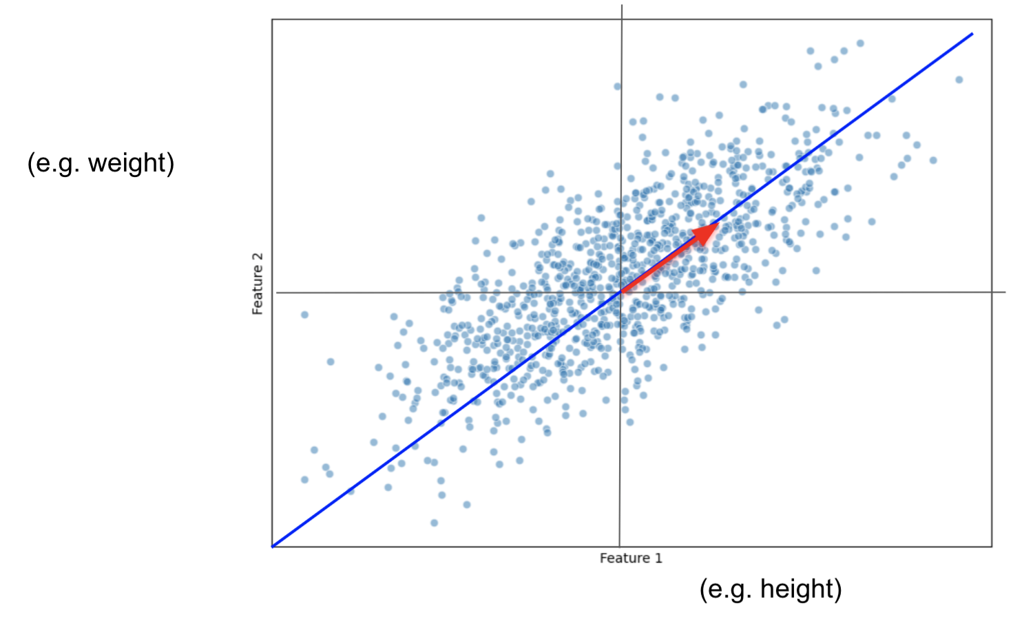
Imagine we only had 2 features: size and weight.
And we plot them this way:
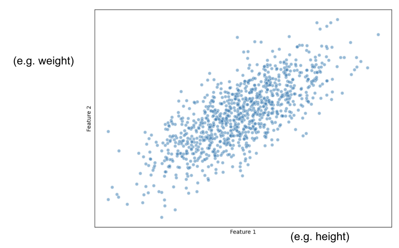
Our task is to project this data into a smaller dimension: a line.
First, for all observations, we calculate the average measure for Height and then, the average measure for Weight
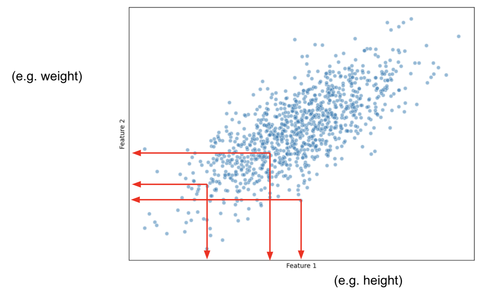
Now, let's shift the data in such a manner that the center of the data, becomes the origin.

** Data points are still related among themselves the same way.
Now that the data is centered, let's fit a random line that captures most of our data points information.
This line MUST pass through the origin.
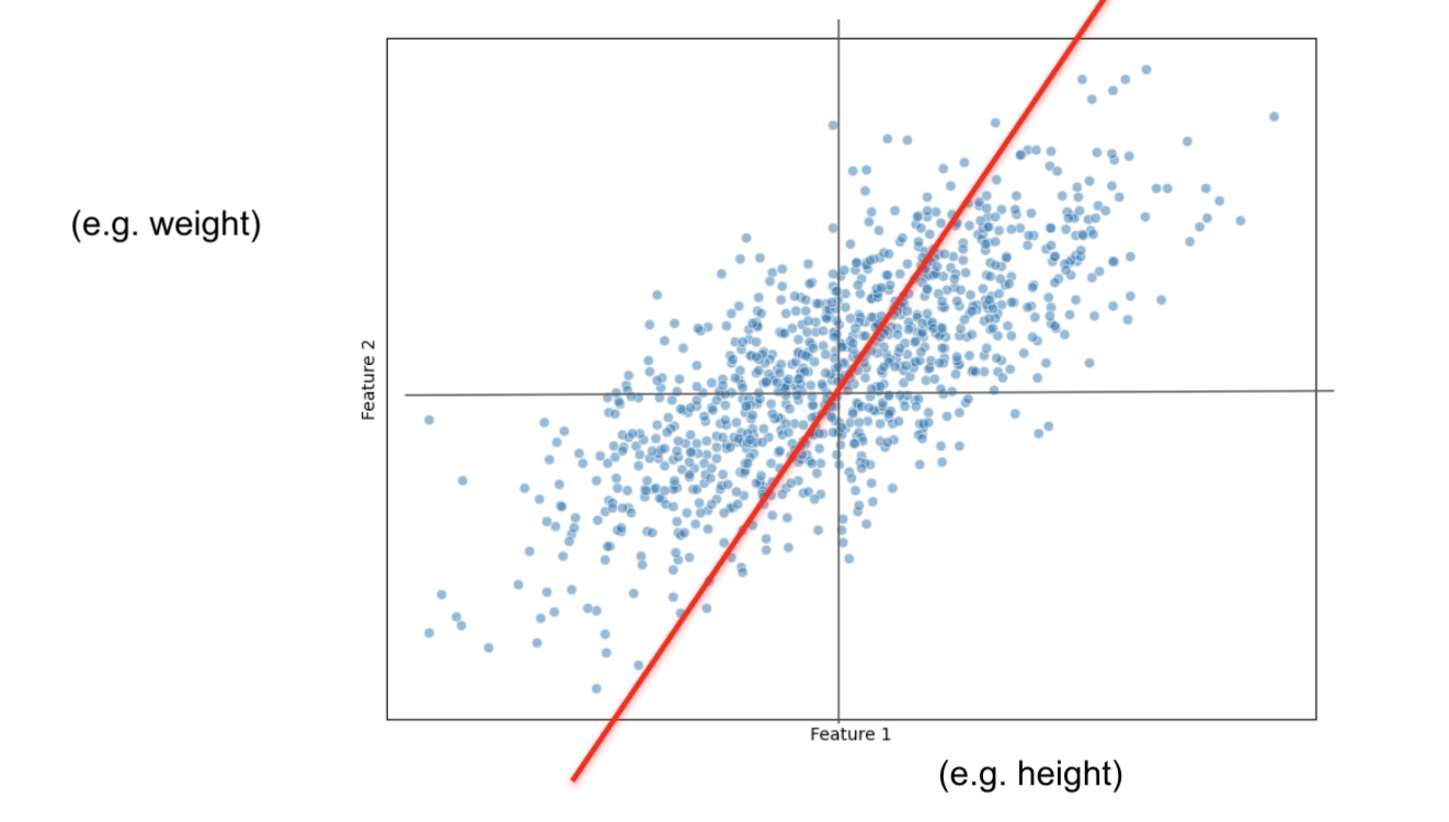
PCAprojects the data on the line.PCAfinds the line that maximizes the distances from the projected points to the origin.- This is the same as minimizing the distance between the line and the data observations.
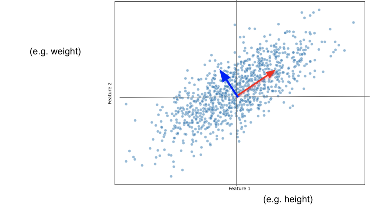
PCA will measure the distance from the origin to each projected observation.
If we only had 5 observations, it would only have 5 distances:
$d_1 + d_2 + d_3 + d_4 + d_5$
and then, squares them up:
${d_1}^2 + {d_2}^2 + {d_3}^2 + {d_4}^2 + {d_5}^2 = SS(distances)$
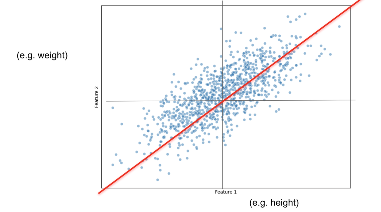
We do this until we get the largest $SS(distances)$
This new line is called Principal Component 1 (PC1)
SS(distances) for PC1 is called the eigenvalue for PC1
Let's say that our PC1 has a slope of 0.5:
For every 2 unit increase in height, we increase 1 unit in weight.
Then for
PC1, height is more important than weight.
Data is more spread out on the height axis
PC1 ends up being a Linear Combination of:
$PC1 = 2*Height + 1*Weight$
When we make the vector have a measure of one, by normalizing it, we end up having the eigenvector.
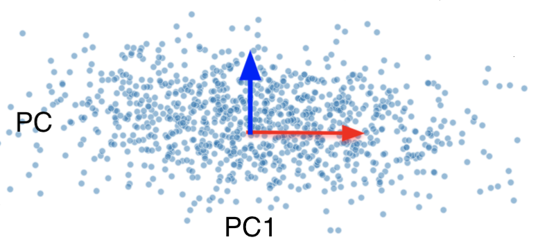
With 2 features, it is easy to find PC2, it has to be the line that also passes through the origin and that is ortogonal to PC1.
If we had 3 or more features, to find PC2 we would have to repeat the process:
i)find the best fitting line that also:
ii) passes through the origin
iii) is perpendicular/ortogonal to PC1
Then PC3 would just have to:
a) pass through the origin
b) be perpendicular to PC1 and PC2
For our final plot, we rotate everything so that PC1 and PC2 are horizontal
Measuring Variation
We will aid ourselves with a Scree Plot to measure variation.
$Variation(PC1) = \frac{SS(distances_{PC1})}{n-1}$
$Variation(PC2) = \frac{SS(distances_{PC2})}{n-1}$
...
$Variation(PCn) = \frac{SS(distances_{PCn})}{n-1}$
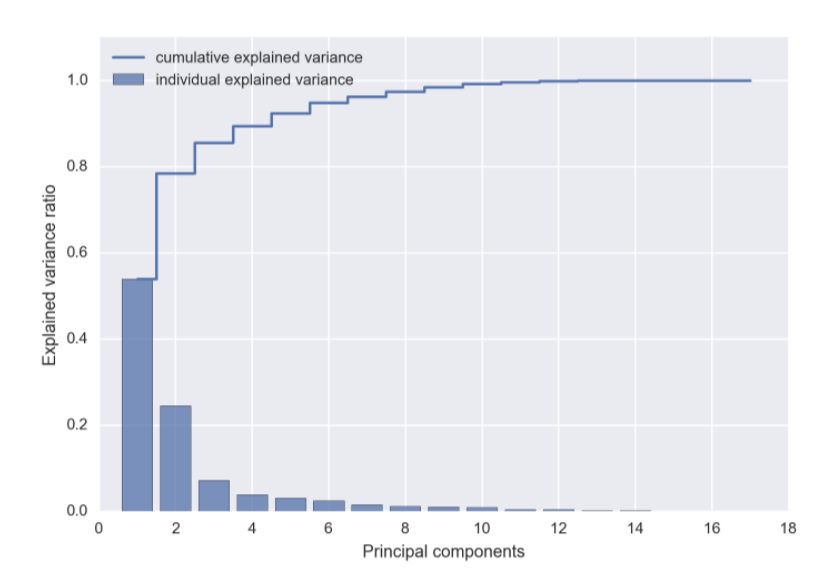
From a Scree Plot you might determine that you only need the first 2 or 3 PCs rather than the complete set of PCs for a better model.
Remember, the max number of PCs that you have:
a) number of features
b) number of observations
Let's apply PCA to the Gremlins dataset for Visualization Purposes
from sklearn.decomposition import PCA

pca = PCA(n_components=2)
pca_components = pca.fit(gremlins_df.drop(['Kmeans_Cluster', 'DBSCAN_Cluster', 'DBSCAN_Cluster_Scaled'], axis=1))
pca_components = pca.transform(gremlins_df.drop(['Kmeans_Cluster', 'DBSCAN_Cluster', 'DBSCAN_Cluster_Scaled'], axis=1))
plt.scatter(pca_components[:, 0], pca_components[:, 1], c=gremlins_df['Kmeans_Cluster'], cmap='viridis')
plt.xlabel('PCA Component 1')
plt.ylabel('PCA Component 2')
plt.title('PCA of Gremlins Dataset with K-Means Clusters')
plt.show()

from sklearn.metrics import silhouette_score

silhouette_kmeans = silhouette_score(gremlins_df.drop(['Kmeans_Cluster',
       'DBSCAN_Cluster', 'DBSCAN_Cluster_Scaled'], axis=1), gremlins_df['Kmeans_Cluster'])
print(f'Silhouette Score for K-Means: {silhouette_kmeans}')
Silhouette Score for K-Means: 0.2964678965605285
PCA to the Gremlins dataset as a Preprocessing Tool
pca_components[:3]
array([[-26.39973483,  -5.38378156],
       [  0.9824435 ,  14.5977015 ],
       [  2.0911697 ,   8.05267201]])
kmeans = KMeans(n_clusters=3, random_state=42)
kmeans_labels = kmeans.fit_predict(pca_components)
from matplotlib.colors import ListedColormap
from matplotlib.offsetbox import OffsetImage, AnnotationBbox

cmap = ListedColormap(["purple", "teal", "yellow"])
plt.scatter(pca_components[:, 0], pca_components[:, 1], c=kmeans_labels, cmap=cmap)
plt.xlabel('PCA Component 1')
plt.ylabel('PCA Component 2')
plt.title('KMeans Clustering on PCA-Reduced Data')

stripe_img = mpimg.imread('img/Stripe.webp')
gizmo_img = mpimg.imread('img/gizmo.png')
brain_img = mpimg.imread('img/brain.jpeg')

centroids = np.array([pca_components[kmeans_labels == i].mean(axis=0) for i in range(3)])

def add_image(ax, img, x, y, zoom=0.2):
    imagebox = OffsetImage(img, zoom=zoom)
    ab = AnnotationBbox(imagebox, (x, y), frameon=False)
    ax.add_artist(ab)

ax = plt.gca()
add_image(ax, gizmo_img, centroids[0, 0], centroids[0, 1], zoom=0.1)
add_image(ax, stripe_img, centroids[1, 0], centroids[1, 1], zoom=0.1)
add_image(ax, brain_img, centroids[2, 0], centroids[2, 1], zoom=.3)

plt.show()

img = mpimg.imread('img/Stripe.webp')
What does PCA Component 1 mean?
feature_importance_pc1 = pca.components_[0]  # Loadings for the first principal component
feature_importance_pc1
array([-0.08743386, -0.00634363,  0.99577796, -0.00985658,  0.01670778,
        0.01697297,  0.00713279,  0.00425874, -0.0028172 ])
features = gremlins_df.drop(columns=['Kmeans_Cluster', 'DBSCAN_Cluster', 'DBSCAN_Cluster_Scaled']).columns
pc1_importance_df = pd.DataFrame({'Feature': features, 'PC1 Loading': feature_importance_pc1})
pc1_importance_df['Absolute Loading'] = pc1_importance_df['PC1 Loading'].abs()
pc1_importance_df = pc1_importance_df.sort_values('Absolute Loading', ascending=False)
pc1_importance_df
| Feature | PC1 Loading | Absolute Loading | |
|---|---|---|---|
| 2 | Color_Intensity | 0.995778 | 0.995778 |
| 0 | Size (cm) | -0.087434 | 0.087434 |
| 5 | Number of Spikes | 0.016973 | 0.016973 |
| 4 | Intelligence | 0.016708 | 0.016708 |
| 3 | Aggressiveness | -0.009857 | 0.009857 |
| 6 | Age (years) | 0.007133 | 0.007133 |
| 1 | Weight (kg) | -0.006344 | 0.006344 |
| 7 | Moisture Exposure (hrs) | 0.004259 | 0.004259 |
| 8 | Fed_After_Midnight | -0.002817 | 0.002817 |
pca = PCA()
pca = pca.fit(gremlins_df.drop(['Kmeans_Cluster', 'DBSCAN_Cluster', 'DBSCAN_Cluster_Scaled'], axis=1))
explained_variance = pca.explained_variance_ratio_
plt.figure(figsize=(8, 5))
plt.bar(range(1, len(explained_variance) + 1), explained_variance, color='skyblue', edgecolor='black')
plt.xlabel('Principal Component')
plt.ylabel('Explained Variance Ratio')
plt.title('Scree Plot (Bar Chart)')
plt.xticks(range(1, len(explained_variance) + 1))
plt.show()

Other Feature Reduction Techniques
- Reducing the number of features in a dataset
- E.g., 1000 rows by 20 columns (features) to 1000 rows by 10 columns
- Helps our machine learning algorithms perform better
- Improves run-time of our algorithms
- Storing and using less data (memory)
- For visualization
Why do dimensionality reduction?
- For visualization:
- The human visual system only works in up to 3 dimensions.
- Our screens are really only 2D.
- To improve the performance of our baseline model
It may or may not work. You will not know until you try.
Feature Selection
The easiest way to reduce features is to keep the most important features and "eliminating" the others.
The resulting feature set will still be interpretable.
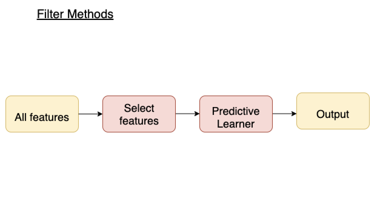
Feature Selection Techniques: Filter and Wrapper Methods
Filter methods
- Measure relevance of feature by correlation with dependent variable (target).
- If feature is correlated with target, keep. Otherwise, discard
- Applied before training ML model
- Advantages:
- Fast, no training involved
- Disadvantages:
- Ignores feature combinations
- Keeps redundant features
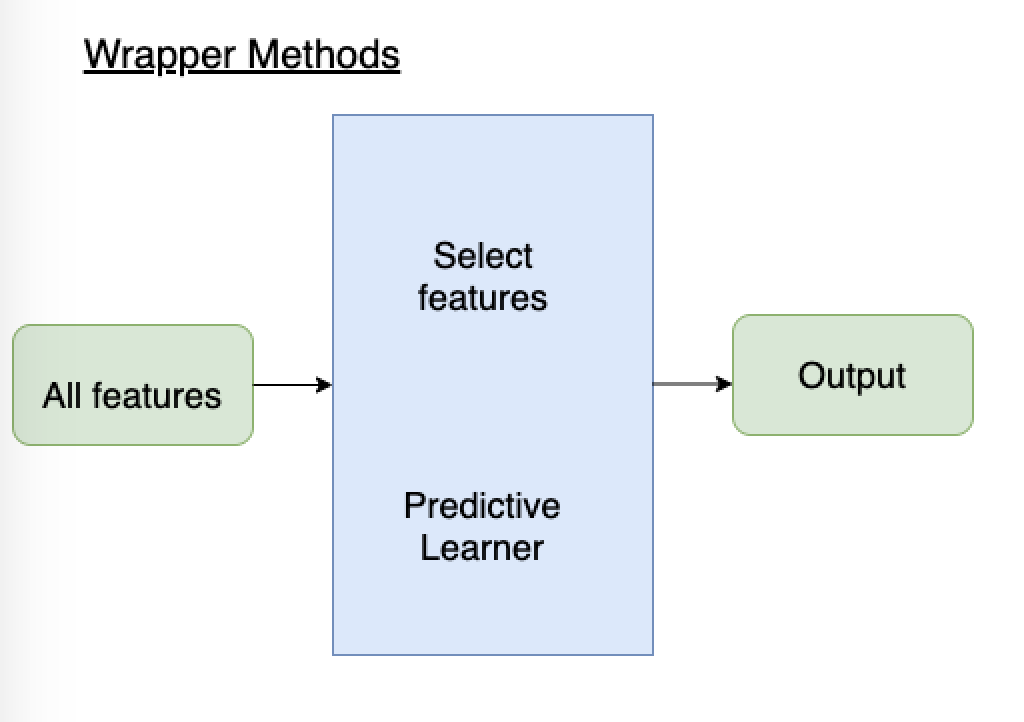
Wrapper methods
- Train ML model with different subsets of feature
- If feature improves performance, add/keep it. Otherwise, ignore/remove it.
- Applied during training ML model
- Advantages:
- Evaluates features in context of others
- Performance-driven
- Disadvantages:
- Slow, retrain model several times
Forward selection wrapper method
- SelectedFeatures = [ ]
- Find F in (AllFeatures - SelectedFeatures) that, if added to SelectedFeatures, best improves model performance
- If adding F improved performance more than some threshold, permanently add it to SelectedFeatures and go back to (2)
Backward elimination wrapper method
- SelectedFeatures = AllFeatures
- Find F in SelectedFeatures that, if removed from SelectedFeatures, decreases model performance the least
- If removing F decreased performance less than some threshold, permanently remove it from SelectedFeatures and go back to (2)
Recursive Feature Elimination
- Decide $k$, the number of features to select.
- Use a model (usually a linear model) to assign weights to features.
- The weights of important features have higher absolute value.
- Rank the features based on the absolute value of weights.
- Drop the least useful feature.
- Try steps 2-4 again until desired number of features is reached
Variable Selection - Wrapper Methods Tips
- Look for implementations,
sklearnhas arfeimplementations, for example - It's not possible to tell which method will work better until you try
- Different variable selection algorithms may give you a different answers
- Different machine learning algorithms with the same variable selection method may give you given answers
- Over this process, you'll find out what features tend to get eliminated and which features tend to be kept (hopefully)